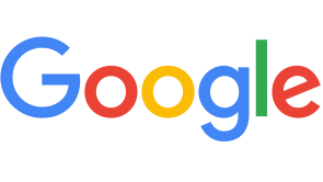
Google recently made a very small tweak to their logo recently, with the change being very miniscule for most of the website's users to notice.
The fact that the change was picked up on, however, shows just how big Google's influence is on the Internet community.
A Reddit user spotted the change earlier this week. The change made on the logo was the move of the second letter "g" to the right by one pixel, and the move of the letter "l" to the right by one pixel and down by one pixel.
Yes, that's it. That's the change.
The change, which is known as an adjustment in kerning in typography terms, is so small that it is best seen when the old Google logo is overlain with the new Google logo.
"Great to see people notice and appreciate even single-pixel changes - we tweaked the logo a little while ago to make sure it looks its sharpest regardless of your screen resolution," said a spokesman of Google.
Reddit users, however, noted that with the slight kerning change, the baseline of the letter "l" and the letter "e" finally line up.
Google has made many changes with its logo over the years, with the last major change being changing the textural, 3D style that it used for over 10 years to the flat, 2D style that the company uses today.
The company also regularly fiddles with its logo on the homepage of their website in animations and artwork known as Google Doodles, which feature different holidays, anniversaries and the lives of famous people. Recent examples of how Google uses its Doodles include remembering the 107th birthday of "Silent Spring" author Rachel Carson, commemorating the 107th birthday of fossil collector Mary Anning, and celebrating the 40th birthday of the Rubik's Cube.
The change in their logo may be small, but small changes are not trivial to Google. In February, the company revealed that it carried out extensive research to determine which shade of blue it should use in links to advertisements. The insights that Google gained from its experiments allowed the company to determine the best shade of blue, picking up an additional US$200 million of annual revenue along the way.
The most recent change in the Google logo could have easily gone unnoticed if not for the eagle eyes of a Reddit user. Nonetheless, Google has its reasons for making the change.
(Source: GIF courtesy of Gizmodo)


