Capcom surprised its fans with a trailer tied up to the new "Street Fighter 6" game. Prior to the revelation, some already knew from the get-go that it would be the popular fighting game in the arcade back in the day.
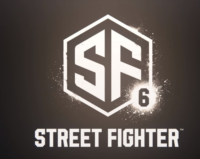
While many have been impressed with the new presentation for Ryu, others pointed out the "terrible" logo for the new installment. Here's what fans said about Capcom's new "SF VI" icon design.
'Street Fighter 6' Logo Looks Like a Clipart

As an all-time favorite street fighting game among classic gamers, "Street Fighter" has already created its strong presence in the gaming industry. Capcom used to feature a vivid font style and color for every logo that is released under the franchise.
Apparently, the logo of the next-gen "Street Fighter 6" title appears to be far different than its predecessors. There's no artsy stroke and highlights in the new icon.
The new Street Fighter 6 logo is $80 on Adobe's Stock site
— Aurich (@aurich) February 21, 2022
I don't even know what to say. I knew it was generic but I didn't realize it was this bad. They searched for "SF" on a stock logo site and rounded a couple corners and added the 6
I cannothttps://t.co/SViXFjElou pic.twitter.com/yOzYePaYfV
Kotaku spotted via Ars Technica creative director Aurich Lawson that the new logo for "SF VI" looked like a clipart from Adobe's stock site. A similar piece was reportedly priced at $80 only. The gaming site compared it side-by-side. It turned out that they were "incredibly" similar based on their borders. The only striking difference is the thickness of them from one another.
Related Article: CAPCOM Confirms 'Street Fighter 6': Game's Teaser Drops, More News in the Summer
Why Fans Hated the 'Street Fighter 6' Logo So Much?
In another report by Comicbook earlier this week, many fans expressed their disappointment over the newly-released logo for Capcom's classic game. According to one user who tweeted about the previous logo designs, the current icon is "painfully bland" and boring.
The new logo for Street Fighter 6 looks terrible. So painfully bland and boring. @CapcomUSA_ , say it ain’t so. pic.twitter.com/Fkrmind0jr
Another Twitter user posted that a freshman design student can easily make the "Street Fighter VI" logo. For this person, it appears to be amateurish, especially for a big and well-funded company.
The new Street Fighter 6 logo could legitimately be made by a freshman design student.
— Kwern (@KwernTV) February 22, 2022
Furthermore, another one commented that the logo can be used as an icon by a "bad" mobile game. There's also one tweet that shows that Capcom ruined the minimalism approach for the new "SF" game.
While Capcom is earning a huge amount of money from its games, someone suggested that the Japanese publisher should allocate a considerable budget for this game.
'Street Fighter V' Ads
Drawing criticisms from the people is not a new thing anymore for Capcom. It felt a similar vibe when "Street Fighter V" came out. Some fans were dismayed over this game because of the ads that continue to affect their gameplay.
Tech Times previously reported that players can remove them by accessing the Battle Settings. Despite this remedy, one user said that it's wrong for the company to incentivize its users for the in-game ads.
With that, Capcom entirely got rid of "Street Fighter 5" ads after the backlash that it faced from its fans. At that time, no one knew if it would be a temporary or permanent change.
Read Also: Unknown Man Reportedly Robs $250K Worth of Rare 'Pokemon' Cards From Minnesota Shop
This article is owned by Tech Times
Written by Joseph Henry
ⓒ 2025 TECHTIMES.com All rights reserved. Do not reproduce without permission.


