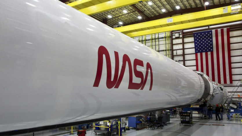
The iconic worm logo from NASA is coming back in full form since its hiatus since 1992 when it was stopped.

Why Change The Logo Now?
NASA delivered an appropriately ecstatic speech titled "The Worm is Back!" last Thursday. "It seems the worm logo wasn't really retired. It was just resting up for the next chapter of space exploration,"
The iconic worm logo first materialized way back in 1975 when NASA was looking for a minimalistic or simplified image to use as its symbol. It was nicknamed "meatball," why the nickname? The meatball, which dates back longer in the 1950s, has a blue disc with stars, red chevron, and "NASA" in the middle.
The worm is still the more iconic logo; however, since it is usually the one that is being printed out for merchandise like t-shirts, mugs, stickers, you name it.
"The retro, modern design of the agency's logo will help capture the excitement of a new, modern era of human spaceflight," said NASA. They said this while sharing a photo of the worm logo emblazoned on the side of the SpaceX Falcon 9 rocket, which will carry the astronauts to the International Space Station.
Read More : Astronaut Moon Home Built by Their Own Urine!
Speaking of astronauts, Space X, and the ISS, here's an article outlining what their partnership is all about and what it means for humanity as a whole.
They originally wanted to announce it on Wednesday but then decided against it because people might think of it as an April Fool's joke, which is a logical choice to postpone it to the next day.
The retro-looking logo will be stamped on the side of the Falcon 9 rocket, which will be used as a part of SpaceX's Demo-2 flight that will launch mid to late May. NASA also mentioned that there is indeed a good chance that you'll be seeing the logo to be featured in more missions in the coming years.
Who Started The Idea of Changing The Logo?
Jim Bridenstine, who is the space agency's administrator, told Ars, he is a "huge fan" of the worm symbol.
"I thought marking the achievement of returning human spaceflight to American soil by bringing back the worm would be a fitting tribute to a historic achievement," he also said, "I'm very appreciative of the partnership with SpaceX and their willingness to work overtime to make this happen."
NASA only had two logos to date, the original "meatball," designed by an employee named James Modarelli back in 1959. Which was shaped like a planet, the stars representing space and the red v-shaped wing represents aeronautics, the orbit around NASA represents space travel.
ⓒ 2026 TECHTIMES.com All rights reserved. Do not reproduce without permission.


