Twitter misinformation labels are getting a design improvement, something that is more eye-catching and attention-grabbing.
The new design provides more details about why a tweet is misleading. It further establishes its context to the users.
The design changes are not the first attempt of Twitter to fight the prevailing issue of misinformation on the internet.
For instance, the microblogging platform previously issued a pop-up label for misleading tweets on November 23. It comes as the COVID-19 pandemic and the United States presidential elections have triggered the rise of sensitive false information.
The warning prompts a person before liking or retweeting a misinformation post.
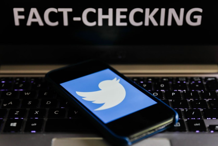
Twitter Misinformation Labels and its New Design
The social media giant announced on July 1 that it is testing a new label design for tweets that the platform deems as spreading misinformation. It will initially pilot for limited desktop Twitter users.
The new labels sport a more colorful design, using visual cues to expand the categories of misinformation tweets. The platform believes that these design elements will inform its users more effectively.
Last year, we started using labels to let you know when a Tweet may include misleading information.
— Support (@Support) July 1, 2021
For some of you on web, we’ll be testing a new label design with more context to help you better understand why a Tweet may be misleading. https://t.co/p1KONJz5Vo pic.twitter.com/m55f4RlMDg
Twitter boasted that the new labels are more "communicative" to the users. They have improved the symbols, colors, and even the copy of the notice.
Twitter Misinformation Labels: Visual Cues
The social media giant also expanded the visual cues of the tweet itself.
According to TechCrunch, the tweets that Twitter tags as "misleading" will have a pink or light red background, which is definitely attention-grabbing. The label further explains why it has turned off the reply, like, and retweet functions.
Meanwhile, the color yellow identifies misleading posts that are not as intentional as the red one. To get the correct information, a single click on the color-coded tweets will show the verified facts.
Before the limited release, Twitter has already tested the color-coded labels. With that, it found that the pink cue encouraged users to click and quote-retweet on the label more.
Moreover, the microblogging site tested numerous colors and symbols, and the reaction of its users before coming up with the new design.
Twitter Misinformation Labels: Other Efforts
Meanwhile, on May 5, Gizmodo hinted that Twitter is releasing three new labels, such as "Get the Latest," "Stay Informed," and "Misleading." It states how wrong a piece of information is.
On September 25, Twitter also released a notice that encourages its users to read the whole article before retweeting it. The prompt reads: "Headlines Don't Tell the Full Story."
Read also: Twitter vs. Misinformation: How Twitter Will Handle Social Media Misinformation with Warning Labels
This article is owned by Tech Times
Written by Teejay Boris
ⓒ 2026 TECHTIMES.com All rights reserved. Do not reproduce without permission.


