Twitter's design changes, such as the new Chirp font and high contrast buttons, are stepping away after some users shared that the fresh look of the platform gave them eye strain or, in some cases, headaches.
As per Gizmodo, Twitter is backpedaling on its new appearance that was supposed to make the microblogging platform a more accessible place for its users.
However, the design update did the opposite for some of the Twitter users--taking a toll on their eyes, and others even reached to an extent of getting migraines.
Twitter's Reverts New Design Changes
It is no doubt that problems like eye strain and headache are alarming enough that it compelled the social media platform to take them seriously.
The discomfort that the high-contrast buttons and the new Chirp font of the platform forced Twitter to retract its design update.
Twitter announced on Friday, Aug. 13, via its Accessibility account that it is making some changes to the new design of the platform, balancing the contrast of all of its buttons to make it easier for the eyes of its users after it caused discomfort.
Plus, the microblogging site also acknowledged the issues concerning its newly-introduced typeface called Chirp, assuring that it is working to fix it.
Twitter further thanked the users for giving their feedback and noted that they are listening to them.
In hindsight, Twitter boasted about the design update on Aug. 11, admitting that "it might feel weird at first." However, the social media platform touted that it makes the user experience more accessible and unique as well.
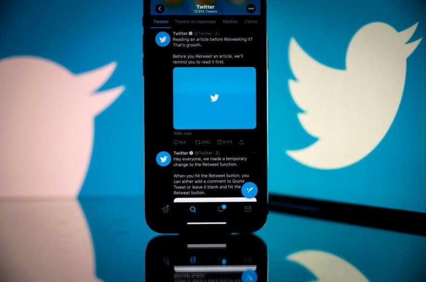
To be precise, the fresh look introduces a new font made exclusively for the microblogging site, buttons with higher contrast for them to catch attention, and the removal of what Twitter calls "visual clutter," including the gray background, and the divider lines.
Read Also : Twitter Adds Apple and Google Third-Party Login Support, Partners with Reuters, AP to Battle Misinformation
Twitter Users and New Design: Headache and Eye Strain
However, some users totally disagree with the radical change that Twitter is introducing, most especially its purpose.
A design researcher and a Twitter user as well, Alex Haagaard, told TechCrunch that the update hit him badly, causing eye strain and a headache.
It turned out that the redesign is not that accessible after all--it's actually doing the harmful opposite.
A Twitter user, MxKelsieSkye, who claims to be autistic, noted that the removal of what the platform dubbed as visual clutter ended up leaving extreme discomfort for her.
She further said that she hoped that the new look is a bad beta that the microblogging site might have overlooked.
Meanwhile, another Twitter user, _psot wrote that Chirp is worsening his astigmatism.
The new typeface worsens my astigmatism. I cannot read without having a headache. My systems typeface is tailored for my eyesight.
— P’Sot (@_psot) August 11, 2021
Elsewhere, Twitter is rumored to be getting a radical design change similar to Facebook.
Related Article: Twitter-Based NFTs Seller, CENT, Acquires $3 Million Funding From Disney, Will.I.Am, Zynga, and MORE!
This article is owned by Tech Times
Written by Teejay Boris
ⓒ 2026 TECHTIMES.com All rights reserved. Do not reproduce without permission.


