Twitter confirms the design changes to its icons on a thread via @TwitterDesign on Friday. "The goal was to create a cohesive set of icons that are bold in shape and style yet still relatable and a little cheeky where possible," the company stated.
This photograph taken on October 26, 2020 shows the logo of US social network Twitter displayed on the screen of a smartphone and a tablet in Toulouse, southern France. LIONEL BONAVENTURE/AFP via Getty Images
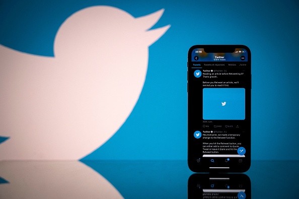
(Photo : LIONEL BONAVENTURE/AFP via Getty Images) This photograph taken on October 26, 2020 shows the logo of US social network Twitter displayed on the screen of a smartphone and a tablet in Toulouse, southern France.
New Design for Icons
If anyone noticed something different with the app's appearance today, you are not tripping. Twitter confirmed that they are changing the design of its icons as they aim to "create a cohesive set." XDA-Developers reported that the company detailed the new design update in a thread through its Design account.
The company started testing these new icons in August last year, as they provide a more modern backdrop if ever they add more changes to the app. A tweet was also visible to the thread before and after the design of the icons to show the differences between the two. The icons now have much thicker lines than before.
As per Twitter Spokesperson Shaokyu Amdo, the company will roll out the new design for its icons over the coming days to iOS, Android, and web. You also might want to check your own Twitter as Amdo stated that some of the users already have the new design. The Verge confirmed that some of the users on the web and in iOS saw the new update.
Keith Miller, one of the people behind the design systems team of Twitter, stated on his account that they were able to fuse the 400 icons as they updated it with a bolder, cleaner, and more aligned. He thanked the team and stated that this will not be possible without their talents.
Along with the team, Twitter Design Foundation also partnered with the Iconist Team and designers Martin David and Andreas Storm. To make the design cleaner than the previous set and for it to be consistent, they established a "new grid, set of guidelines, and techniques."
The 'Chirp' Font
Twitter also rolled out its new font on the same date as they test the new design for its icons. The 'Chirp' font was confirmed when the official account of the company tweeted "Wait did our font change? Okay, confirmed. It did."
The company described it as one part of a broader brand refresh that they presented last January 2021. They added that "Chirp strikes the balance between messy and sharp to amplify the fun and irreverence of a Tweet, but can also carry the weight of seriousness when needed.
The Verge stated that font was previously used by the company for its promotional materials and graphics. As per Twitter Creative Director Global Brand Derrit DeRouen, it was his 'persona desire' for this to be Twitter's own font.