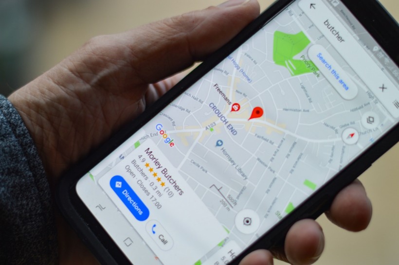
The latest Google Maps color scheme update rolled out weeks ago, has become a hot topic of discussion, igniting passionate debates and online banter.
Users, particularly during the Thanksgiving travel week, have expressed mixed feelings about the new visual aesthetic.
Gray Roads and Teal Water: A Shift from Tradition

The colors for Google Maps have been updated. Surprisingly, this had disappointed many people even the app's former designer.
A notable alteration in the color palette involves the transformation of roads from yellow to gray and bodies of water from deep blue to teal.
Even parks have changed, switching their familiar green hue to a minty shade. This shift has triggered a wave of discontent among users who find the new colors less appealing.
Related Article: Google Maps Hacks 2023: Best Features for Holiday Travelers
From Frustration to Disapproval
Former Google Maps designer Elizabeth Laraki voiced her dissatisfaction with X, formerly known as Twitter. She described the updated color scheme as "colder, less accurate, and less human."
Laraki also drew a comparison, stating that the new coloring resembled that of Apple Maps rather than the traditional Google Maps style. Her post not only critiqued the color change but also suggested ways to enhance the overall user interface.
Laraki's sentiments resonated with others who echoed her opinion on the cold and less contrasting nature of the new colors. The dissatisfaction found its way to online platforms like X and Reddit, where users expressed frustration over the lack of clarity regarding the rationale behind such a dramatic visual transformation.
Google's Response and Design Intentions
In response to the feedback, a Google spokesperson explained to CNBC that the updates were meticulously designed based on extensive research and user feedback. The aim was to enhance usability and understanding of the map.
According to Google, the darker roads are intended to closely resemble actual roads, providing a better canvas for essential details like lanes.
Public Perception and Contrast Concerns
Despite Google's explanations, the online forums predominantly showcased discontent with only a few users expressing support for the new color scheme.
The controversy surrounding the color update has become a focal point of discussion, overshadowing other recent Google Maps enhancements, such as new ways to find activities and the incorporation of emojis.
The online debate continues as to why Google chose to use "colder" colors on the navigation app. The public's perception of the Google Maps color scheme remains divided and this might prompt the company to address the issue for the next few days to come.
Previously, Google Maps announced that emojis can now be used by the users. They will be an important feature that will help the adventurers bookmark specific areas they want to visit.
The addition of emoji support is a crucial move so travelers can search places faster. There's no need to spell the names of the landmarks you want to visit next time.
Read Also: Waze's New AI-Powered Feature Notifies Users of Crash-Prone Roads


